2021. 10. 21. 11:27ㆍReact/문법
.Button {
	& + & { margin-left: 1rem; }
}
& + & 가 의미 하는 것은 .Button + .Button 입니다. 만약 함께 있다면 우측에 있는 버튼에 여백을 설정 한 것
- Template Literal : 문자열 조합을 더욱 쉽게 할 수 있게 해주는 ES6 문법
const name = 'react';
const message = `hello ${name}`;
- Tagged Template Literal : 내부의 값을 조회하고 싶을 때 사용할 수 있는 문법, template literal 앞에 tag가 붙어있는 형식(여기서는 favoriteColors)
const red = '빨간색';
const blue = '파란색';
function favoriteColors(texts, ...values) {
  console.log(texts);
  console.log(values);
}
favoriteColors`제가 좋아하는 색은 ${red}과 ${blue}입니다.`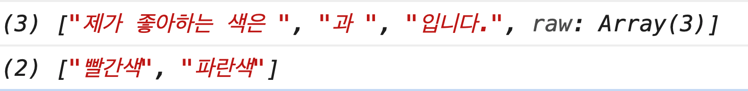
- Styled Component 사용법(props이용)
import React from 'react';
import styled, { css } from 'styled-components';

const Circle = styled.div`
  width: 5rem;
  height: 5rem;
  background: ${props => props.color || 'black'};
  border-radius: 50%;
  ${props =>
    props.huge &&
    css`
      width: 10rem;
      height: 10rem;
    `}
`;

function App() {
  return <Circle color="red" huge />;
}

export default App;
- ThemeProvider 및 반복 코드 리팩토링
function App() {
  return (
    <ThemeProvider
      theme={{
        palette: {
          blue: '#228be6',
          gray: '#495057',
          pink: '#f06595'
        }
      }}
    >
      <AppBlock>
        <Button>BUTTON</Button>
      </AppBlock>
    </ThemeProvider>
  );
}
import React from 'react';
import styled, { css } from 'styled-components';
import { darken, lighten } from 'polished';
const colorStyles = css`
${({ theme, color }) => {
const selected = theme.palette[color];
return css`
background: ${selected};
&:hover {
background: ${lighten(0.1, selected)};
}
&:active {
background: ${darken(0.1, selected)};
}
${props =>
props.outline &&
css`
color: ${selected};
background: none;
border: 1px solid ${selected};
&:hover {
background: ${selected};
color: white;
}
`}
`;
}}
`;
const sizes = {
large: {
height: '3rem',
fontSize: '1.25rem'
},
medium: {
height: '2.25rem',
fontSize: '1rem'
},
small: {
height: '1.75rem',
fontSize: '0.875rem'
}
};
const sizeStyles = css`
${({ size }) => css`
height: ${sizes[size].height};
font-size: ${sizes[size].fontSize};
`}
`;
const fullWidthStyle = css`
${props =>
props.fullWidth &&
css`
width: 100%;
justify-content: center;
& + & {
margin-left: 0;
margin-top: 1rem;
}
`}
`;
const StyledButton = styled.button`
/* 공통 스타일 */
display: inline-flex;
outline: none;
border: none;
border-radius: 4px;
color: white;
font-weight: bold;
cursor: pointer;
padding-left: 1rem;
padding-right: 1rem;
/* 크기 */
${sizeStyles}
/* 색상 */
${colorStyles}
/* 기타 */
& + & {
margin-left: 1rem;
}
${fullWidthStyle}
`;
function Button({ children, color, size, outline, fullWidth, ...rest }) {
return (
<StyledButton
color={color}
size={size}
outline={outline}
fullWidth={fullWidth}
{...rest}
>
{children}
</StyledButton>
);
}
Button.defaultProps = {
color: 'blue',
size: 'medium'
};
export default Button;- Nested CSS 문법
const DialogBlock = styled.div`
  h3 {}
  p {}
`;
- styled-components로 컴포넌트의 스타일을 특정 상황에서 덮어쓰는 방법
const ShortMarginButton = styled(Button)`
  & + & {
    margin-left: 0.5rem;
  }
`;
- animation 구현
const fadeIn = keyframes`
  from {
    opacity: 0
  }
  to {
    opacity: 1
  }
`;

const slideUp = keyframes`
  from {
    transform: translateY(200px);
  }
  to {
    transform: translateY(0px);
  }
`;

const DarkBackground = styled.div`
 ...

  animation-duration: 0.25s;
  animation-timing-function: ease-out;
  animation-name: ${fadeIn};
  animation-fill-mode: forwards;
`;

const DialogBlock = styled.div`
  ...

  animation-duration: 0.25s;
  animation-timing-function: ease-out;
  animation-name: ${slideUp};
  animation-fill-mode: forwards;
`;
사라지는 효과를 구현하려면 Dialog 컴포넌트에서 두개의 로컬 상태를 관리해주어야 합니다. 하나는 현재 트랜지션 효과를 보여주고 있는 중이라는 상태를 의미하는 animate, 나머지 하나는 실제로 컴포넌트가 사라지는 시점을 지연시키기 위한 localVisible 값입니다.
그리고 useEffect 를 하나 작성해주어야 하는데요, visible 값이 true 에서 false 로 바뀌는 시점을 감지하여 animate 값을 true 로 바꿔주고 setTimeout 함수를 사용하여 250ms 이후 false로 바꾸어 주어야 합니다.
추가적으로, !visible 조건에서 null 를 반환하는 대신에 !animate && !localVisible 조건에서 null 을 반환하도록 수정해주어야 합니다.
  useEffect(() => {
    // visible 값이 true -> false 가 되는 것을 감지
    if (localVisible && !visible) {
      setAnimate(true);
      setTimeout(() => setAnimate(false), 250);
    }
    setLocalVisible(visible);
  }, [localVisible, visible]);

if (!animate && !localVisible) return null;'React > 문법' 카테고리의 다른 글
| API 연동 - 커스텀 Hook or 라이브러리 이용 (0) | 2021.10.22 |
|---|---|
| API 연동 (0) | 2021.10.22 |
| Lifecycle Method (0) | 2021.10.21 |
| 클래스형 컴포넌트 (0) | 2021.10.21 |
| Immer 라이브러리 (0) | 2021.10.20 |